
Information Center
Your Health. Your Family. Your Choice.
|
|
National Vaccine Information Center Your Health. Your Family. Your Choice. |
The MedAlerts Blog |
This month, let's look at the most simple of VAERS data searches: Age. In particular, we will ask what is the typical age of a VAERS patient, and what is the typical age of a patient who died following a vaccination.
Now if vaccination-related deaths happen uniformly, to people of all ages, then the two curves should look the same. If, however, vaccination-related deaths happen more predominantly to certain age groups, then this will stand-out. Here are the graphs:
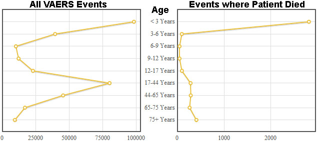
The graph on the right (VAERS events where the patient died) is surprising. It shows a much stronger peak among young children (below age 3). This peak is so strong that it even towers over the wide grouping of 17-44 year-olds.
There are really two problems with these graphs: (1) the age groupings are not uniform, making some groupings stand out unfairly, and (2) it would be helpful to analyze the 0-3 year old range in more detail to see exactly when these children are dying.
To solve this problem, MedAlerts lets you set different age groupings. It is another of the site's "special features," so to use it you must check the "Expert Mode" box in the upper-right. Then, instead of making a graph of Age, make a graph of Age, Custom. Custom Age graphs let you specify where you want the age breaks to occur. There are even a few buttons on the right side of the age break section that automatically fill it in with some "standard" schemes.
So let's redo the above two graphs, but this time use the age breaks that CDC Wonder suggests (click "Set Wonder" in the Custom Age section). The results are here:
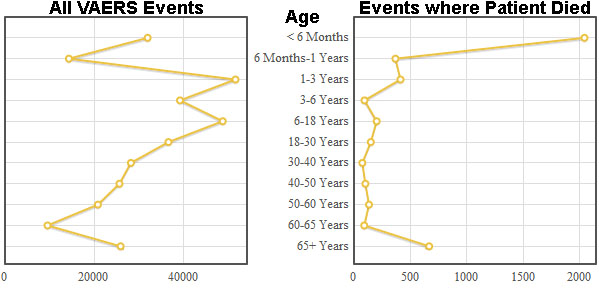
We also see in the graph of patients who died (on the right) that the peak for young people continues to be pronounced, and that this peak happens in the first 6 months of life.
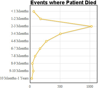
Can we explore this at even more detail? Just set the age breaks to be even smaller. The graph below sets age breaks at 0.1 years, 0.2 years, 0.3 years, etc. This is the level of resolution that appears in VAERS reports (they seem to report age in tenths of a year, rather than twelvths of a year as you might expect). The graph below shows the age of patients who died in the first year of their life:
<< 3/2011: Gender and VAERS data 5/2011: Flaws in VAERS data >>
Copyright ©
2026 National Vaccine Information Center. All rights reserved.
21525 Ridgetop Circle, Suite 100, Sterling, VA 20166